If you own a business, you know that your website is one of your most important tools. Especially if platforms like Instagram were to shut down tomorrow 😳! Your brand’s digital home should inspire your audience to stay a while and connect. As a brand and web designer, here are 3 elements your website needs:

Include These 3 Must Have Elements on Your Website
1. Consistency with the Little Details
This should be no surprise coming from a brand and web designer, but the little details on your website really do matter! The minor visual details are key for building and communicating trust with your potential clients / shoppers. Everything from spacing and alignment, to general consistency such as colors, fonts, and presentation.
Example:
If you have an e-commerce brand and would like to showcase product reviews or 5-star ratings, make sure every product is showcasing ratings – not just your most popular products. It’s better to leave them all off and showcase the reviews on your social media than make shoppers feel uneasy about a seemingly “unrated” product.
~ Everyone knows the feeling of a website being a little “off.” Websites that don’t take these elements into account can make us feel uneasy about inquiring or purchasing. You run the risk of potential customers leaving your site!
2. Brand Storytelling
Your customers are looking to buy from brands that they feel connected to. Creating emotional bonds with your audience is a key element to include on your website, as well as throughout all of your marketing.
Don’t be afraid to share your personal story or how your brand came to be! 😊
Additionally, showcase your value proposition by making it clear why buyers should choose your brand instead of any other.
It’s important that you don’t just tell people about your product or service – instead, show your brand as the solution to a problem that they have!
3. Website Elements “Above the Fold”
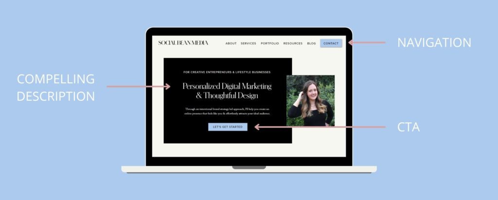
“Above the fold” refers to the area of a website that is first seen before scrolling. Keep this area clear and concise – if visitors don’t immediately feel like your brand will be a solution to what they’re looking for, they’ll just leave! 😳
(The term originally comes from newspaper publishing, and was used to describe the content located on the top half of the front of a folded newspaper!)
The key is to speak directly to your ideal client in this area!
Think of this part of your website like the first few lines of a TikTok/Reel – the ‘hook’ that keeps you wanting to watch more. The goal is to connect and inspire your audience to keep scrolling or take action on the spot.
This area of your website, both on desktop and on mobile, is the most important area because it is used to:
- Hook your visitor into continuing to scroll
- Concisely explain what is it that you do / sell
- Tell the user what you want them to do next (this is your call to action button or link)

Enjoying these must have website elements? Learn more by following me on Instagram or TikTok
If you’re ready to give your brand the love it deserves with a strategic, intentionally designed website that draws in your audience, check out my services page to learn more about we can accomplish by working together. Check out my client application form here so we can schedule a discovery call to get to know each other!